The Motive:
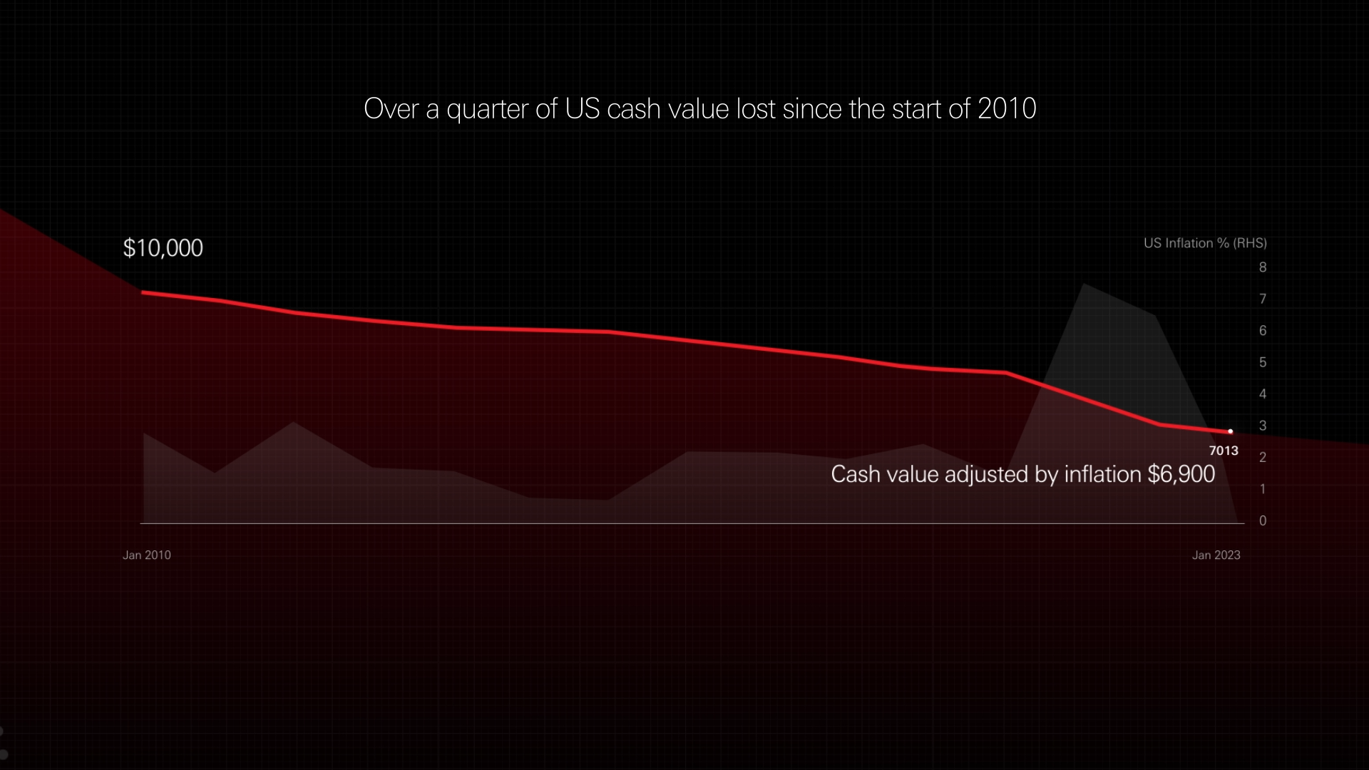
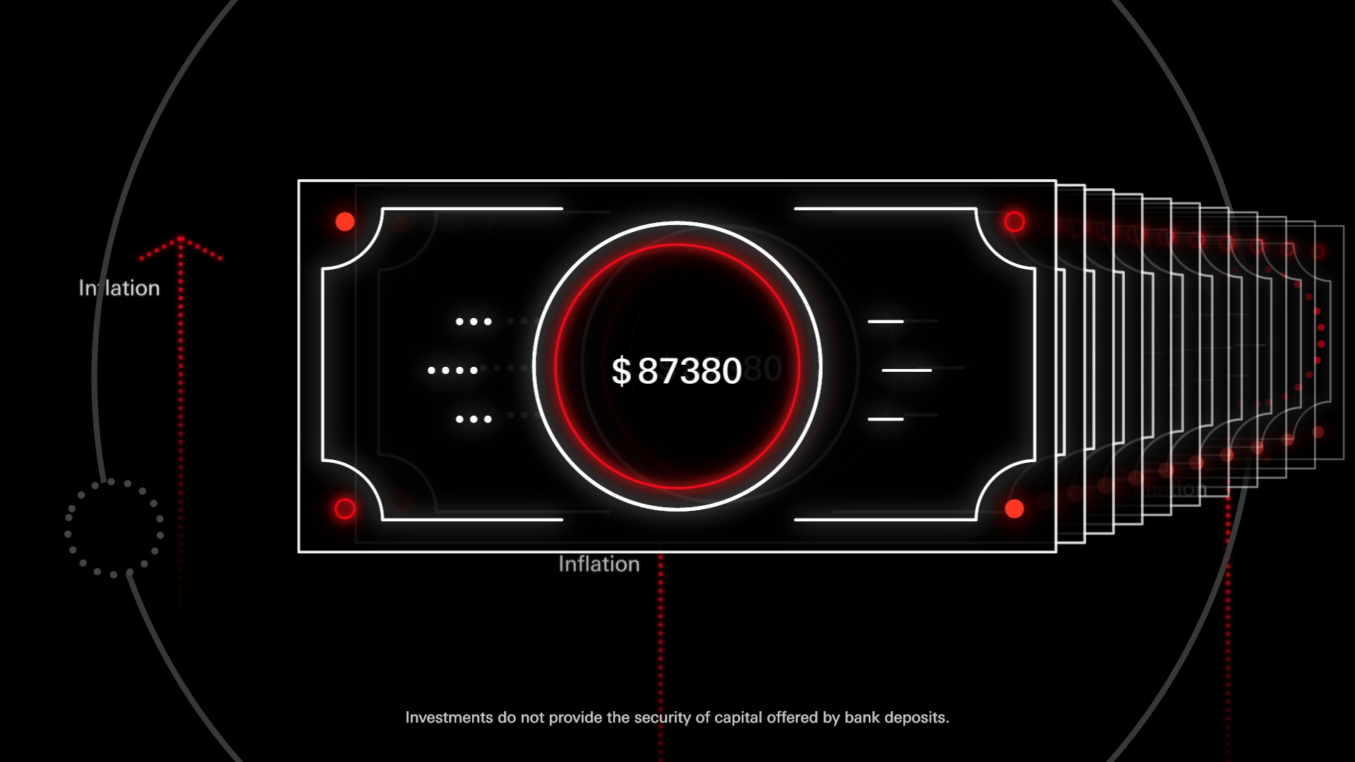
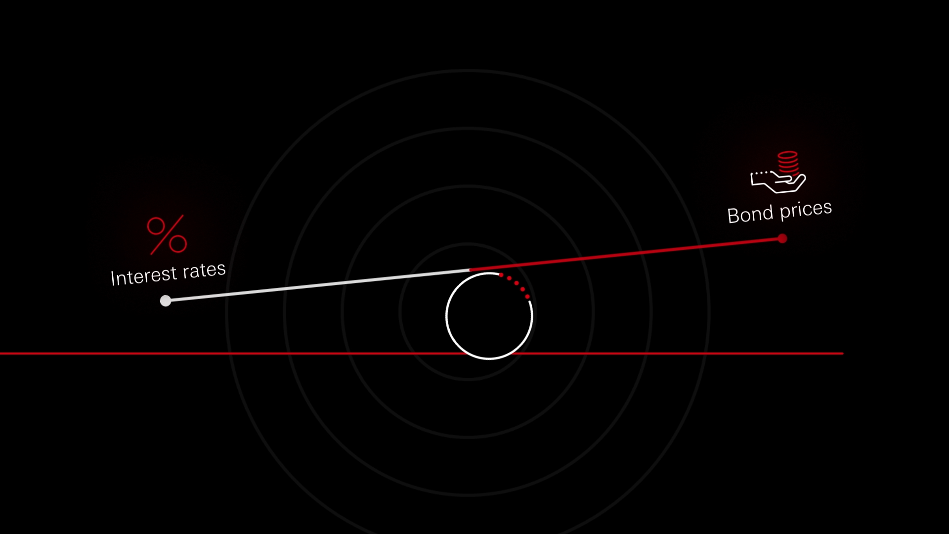
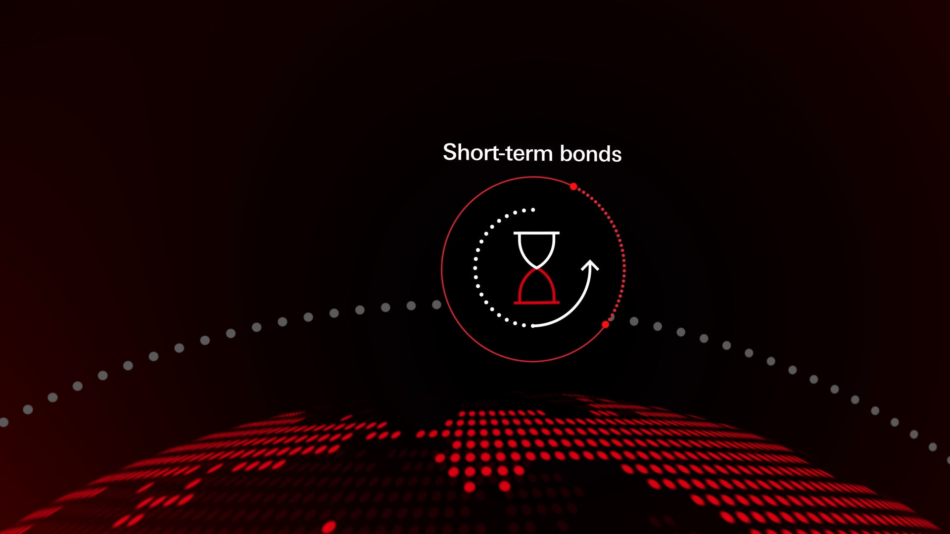
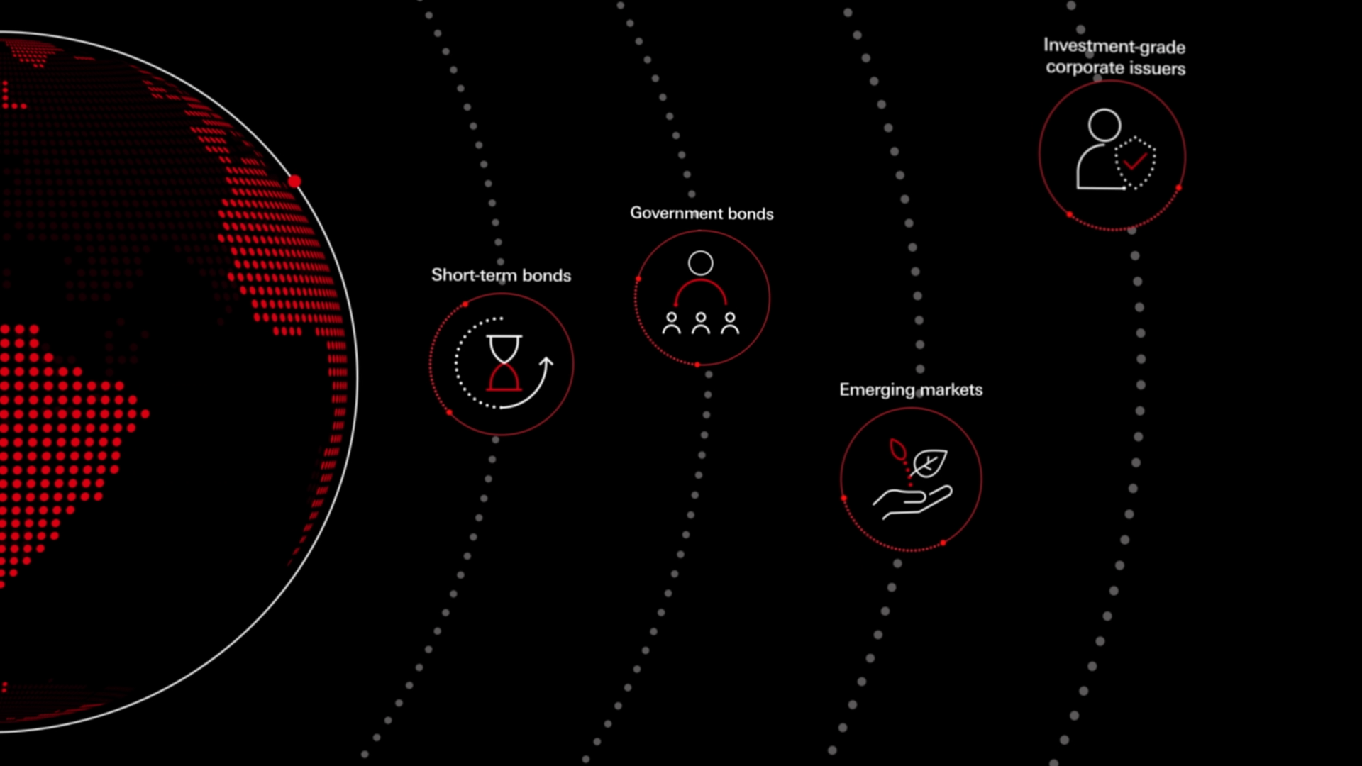
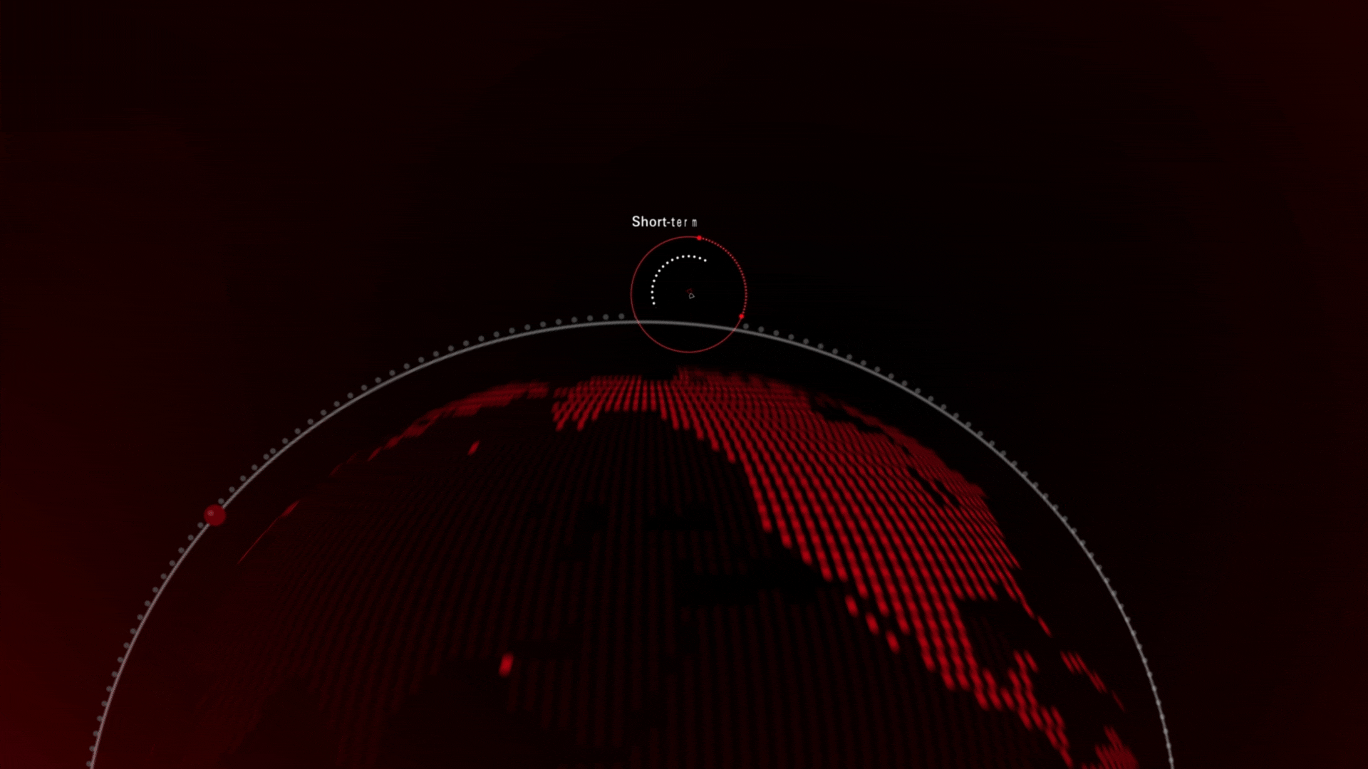
In a world where idle cash loses value to inflation and underperforming bank products, HSBC took a bold step to empower investors. The "Put Cash to Work" campaign was designed to showcase how fixed-income solutions, like Global Short Duration Bonds and Securitised Credit Bonds, can safeguard wealth, generate better yields, and provide stability.By addressing this challenge, HSBC positioned itself as a trusted guide for navigating financial uncertainty with innovative and practical strategies.
The Problem:
The creative challenge lay in working within strict visual guidelines: a flat graphic style, restricted use of red as the primary color, and a preference for minimalism. Red, while symbolizing urgency and power in finance, is visually striking and difficult to balance, especially on black backgrounds.The task was to maintain clarity, elegance, and engagement without overwhelming the audience.
Our Solution:
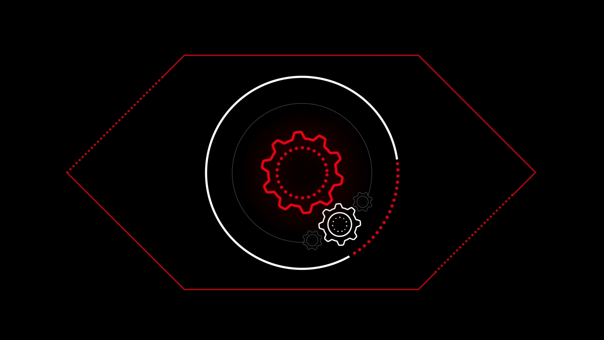
We turned to contrast, using black and white as the frame, allowing red to pulse like the lifeblood of the story.To bring the vision to life, we anchored the visuals in black and white, balancing the strength of red to create harmony.
Red became the heartbeat of the story, emphasizing key messages with precision. Using a faux 3D approach and smooth transitions, we added depth while preserving the minimalist style.
The result was a polished, immersive video that transformed a challenging palette into a dynamic and captivating experience, perfectly reflecting HSBC’s bold approach to helping clients put their cash to work.
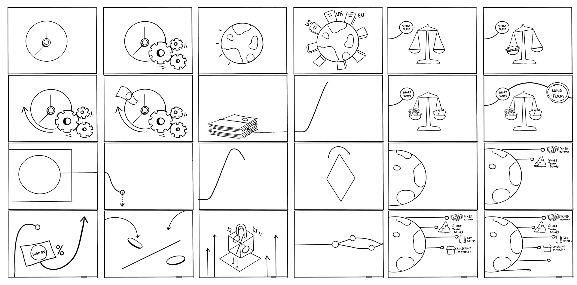
StoryBoard
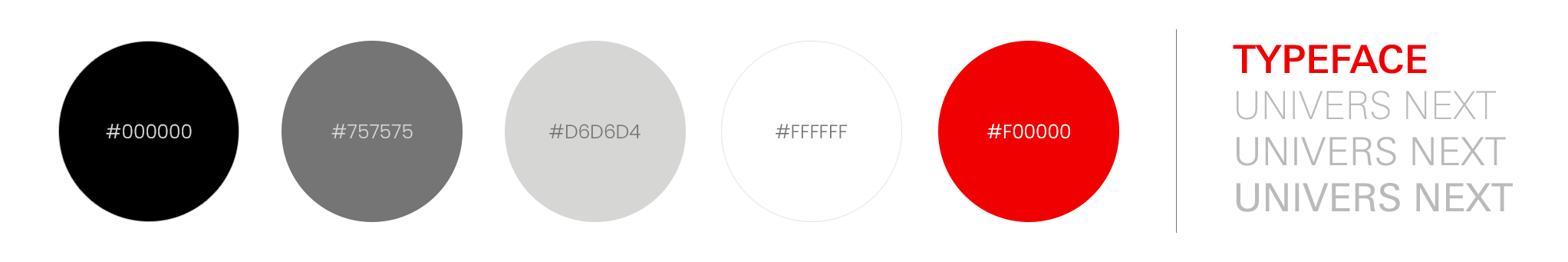
Colour | Typeface
Frame Design
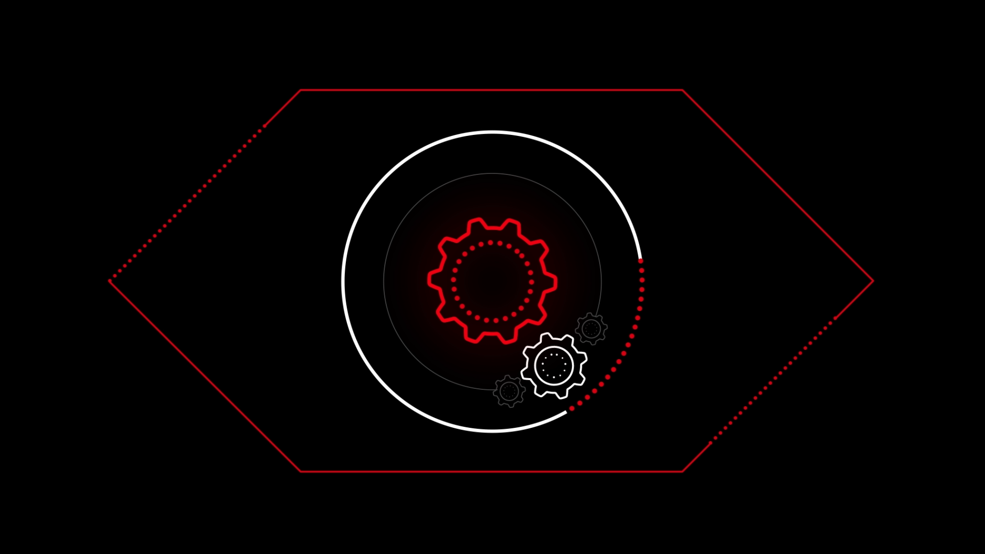
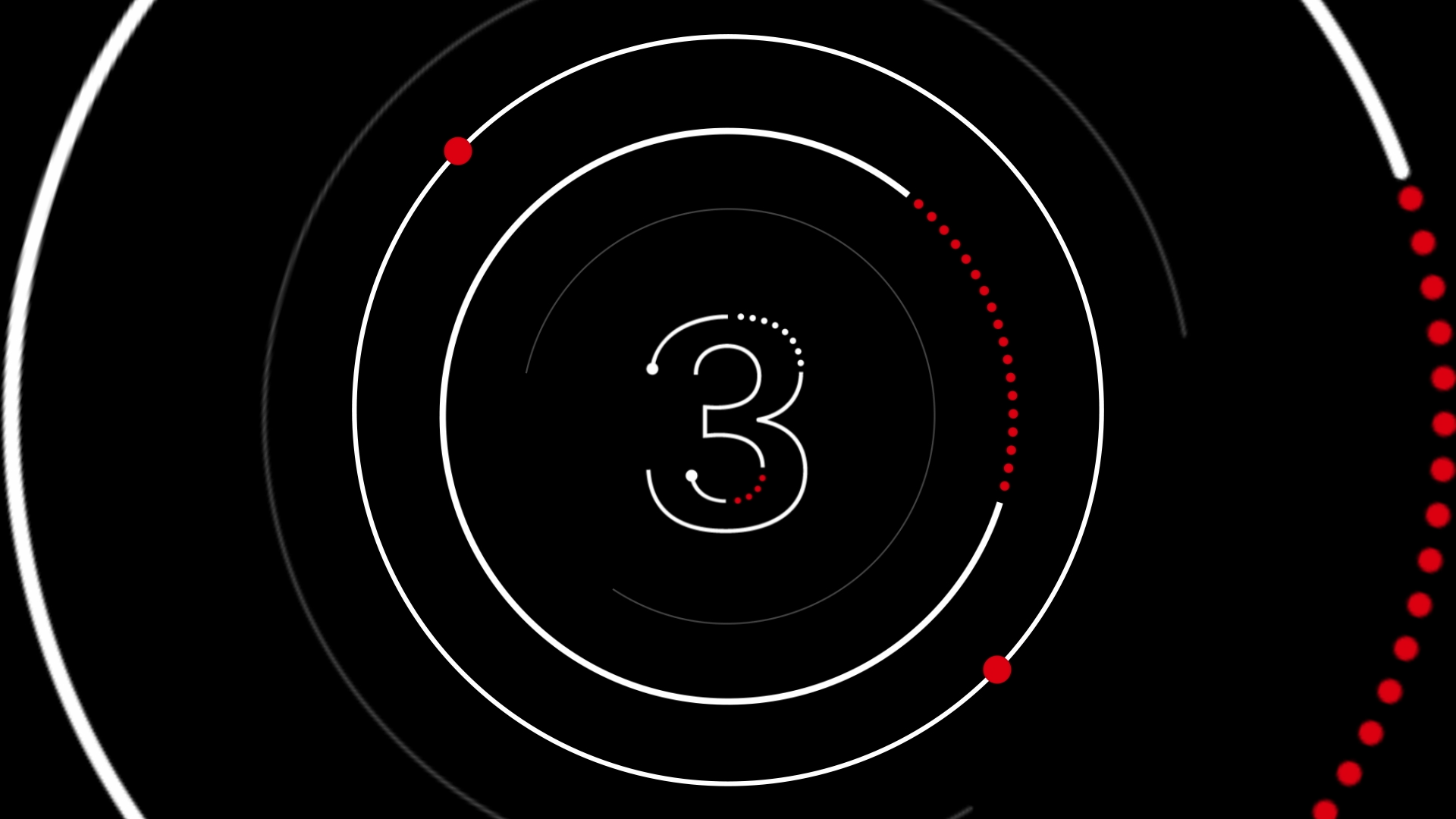


Frame Design


Credits
Client : HSBC (Singapore)
Agency: Rolling Earth Pictures (Hong Kong)
Creative Direction: Sanil Menda | Abhishek Bairwan
Storyboard Artist: Shweta Thube
Design: Abhishek Bairwan
Animation: Prasad | Abhishek Bairwan
Editor: Sanil Menda
Sound Designer: Pramod Srinivasan

🙈
Nahi chalega! 😜